Health Domain
2022 -2023
VISIT WEBSITE
Health Domain is a Med Tech platform for patients to books doctors, scannings and also to manage their medical docs.
Health Domain is a Med Tech platform for patients to books doctors, scannings and also to manage their medical docs.
UX Research
INTERACTION DESIGN
USER EXPERIENCE
prototyping
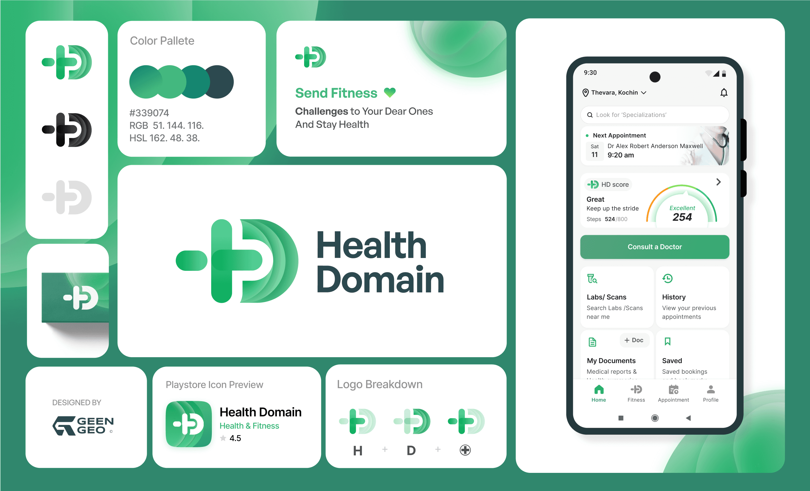
Logo & Branding


I’ve worked from start to finish for both patient booking app and Doctors App for patient cosunltancy management. My fav part is HD score.
I’ve worked from start to finish for both patient booking app and Doctors App for patient cosunltancy management. My fav part is HD score.
What is HD score ?
What is HD score ?
The HD score is a metric that quantifies an individual's overall health and well-being based on their daily steps walked. The calculation of the HD score involves several steps, ensuring a comprehensive evaluation.
Firstly, the number of steps taken by a person over a specified period, typically a day, is recorded using smart devices with step-tracking capabilities. The daily step counts are converted using a formula which calculates the HD score.
HD score, is generated as a unique fitness score in order to compare the fitness status by challenging our friend and family to keep motivated
HD score, is generated as a unique fitness score in order to compare the fitness status by challenging our friend and family to keep motivated
Research
Research
In reserach phase I’ve done a competitive analysis of performing fitness apps and gamifications on it. To understand main user flows and interactions.
In reserach phase I’ve done a competitive analysis of performing fitness apps and gamifications on it. To understand main user flows and interactions.

Why to redesign HD score ?
Why to redesign HD score ?
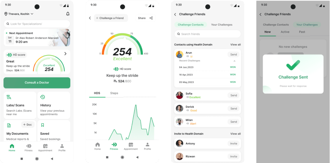
The challenge point
The challenge point
The user can send challenges and the point calculation is based on the fitness challenge we won or loss with our mates.
First we redesigned the UI and later decide to remove challenge point calculation from the app, just need to show total challenges ,win or lost count. all because the complex challenge point calculations.
Challenge point calculation
If the user accepts the challenge Now - the Won user will get +3 points
If the user accepts the challenge 10 days after - The Won user will get +5 points
If the user “Declines” challenge will deduct -1 points
If the user “lose” the challenge will deduct -2 points

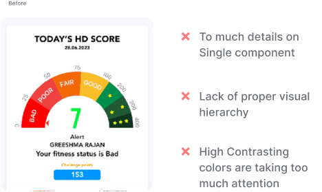
Too many status levels
Too many status levels
HD score has too many status according to the score level, If score is between 0 to 25 your status is bad. Likewise 7 status and all are displayed in UI meter itself making UI cluttered. Also current colors and texts are not much user friendly For example to denote lower score the color and text used are red and bad.
UI is designed in old design color palette, which is something off from our new color palette.
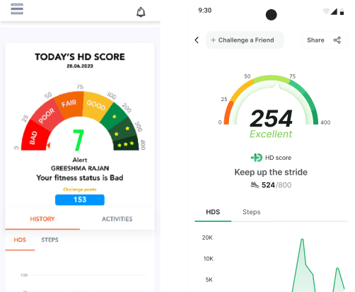
HD Score card
HD Score card
Since app is patient focused, we need to make them aware about fitness score and sending challenges of the app. Best solution is to create a card showing current HD score and status in Home screen
Since app is patient focused, we need to make them aware about fitness score and sending challenges of the app. Best solution is to create a card showing current HD score and status in Home screen


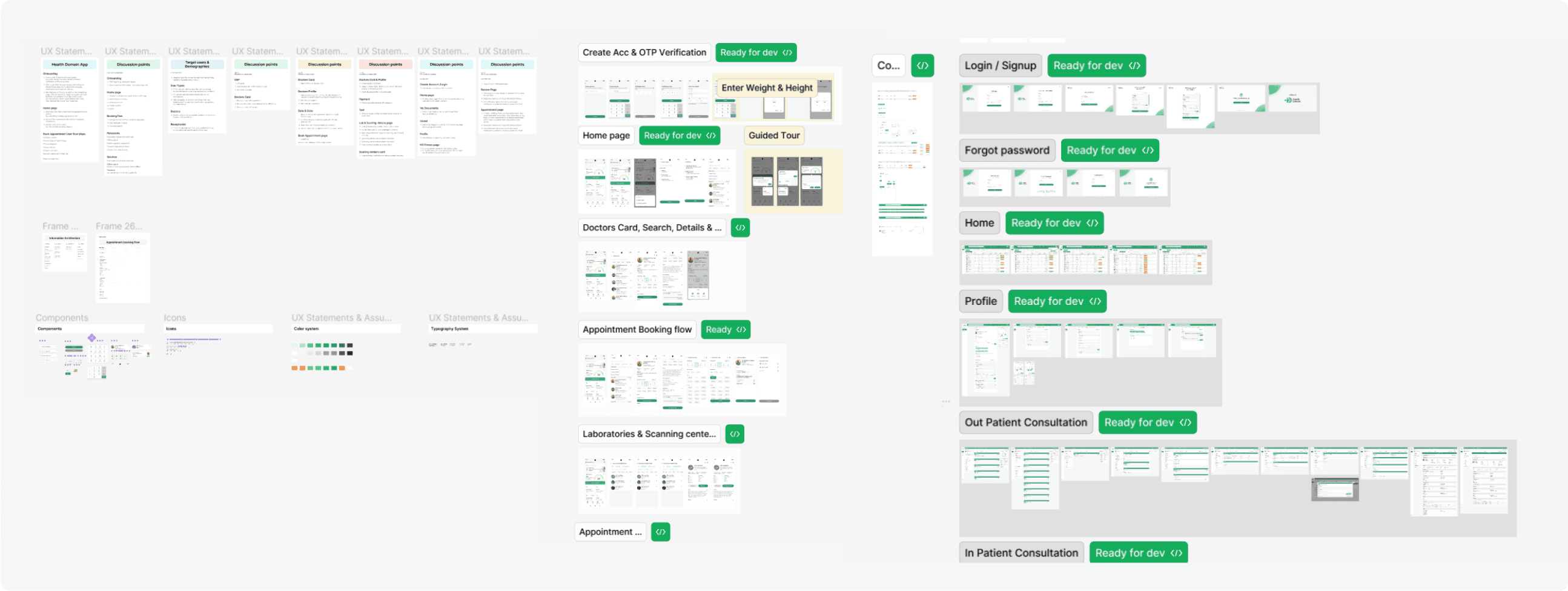
App and Dashboard Designs
App and Dashboard Designs
Solution for Business
Solution for Business
Branding
Branding
Result & Learnings
Result & Learnings
Result
Result
After Finishing project I felt like my medical internship was over. Being from a unterrooty to something I’m familiar takes lot of effort and self learnings and collaborations with stakeholders
After Finishing project I felt like my medical internship was over. Being from a unterrooty to something I’m familiar takes lot of effort and self learnings and collaborations with stakeholders
Learned about how Med Tech apps are working in patients and doctors perspective.
